Print: Roam & Revel Magazine
Project Outline: To develop a memorable magazine design that stands out in a saturated market that is compelling to both experienced & inexperienced modern nomads.
Scope: Magazine Strategy, printed marketing
Aesthetic: Adventurous, sophisticated, wanderlust-driven, soulful
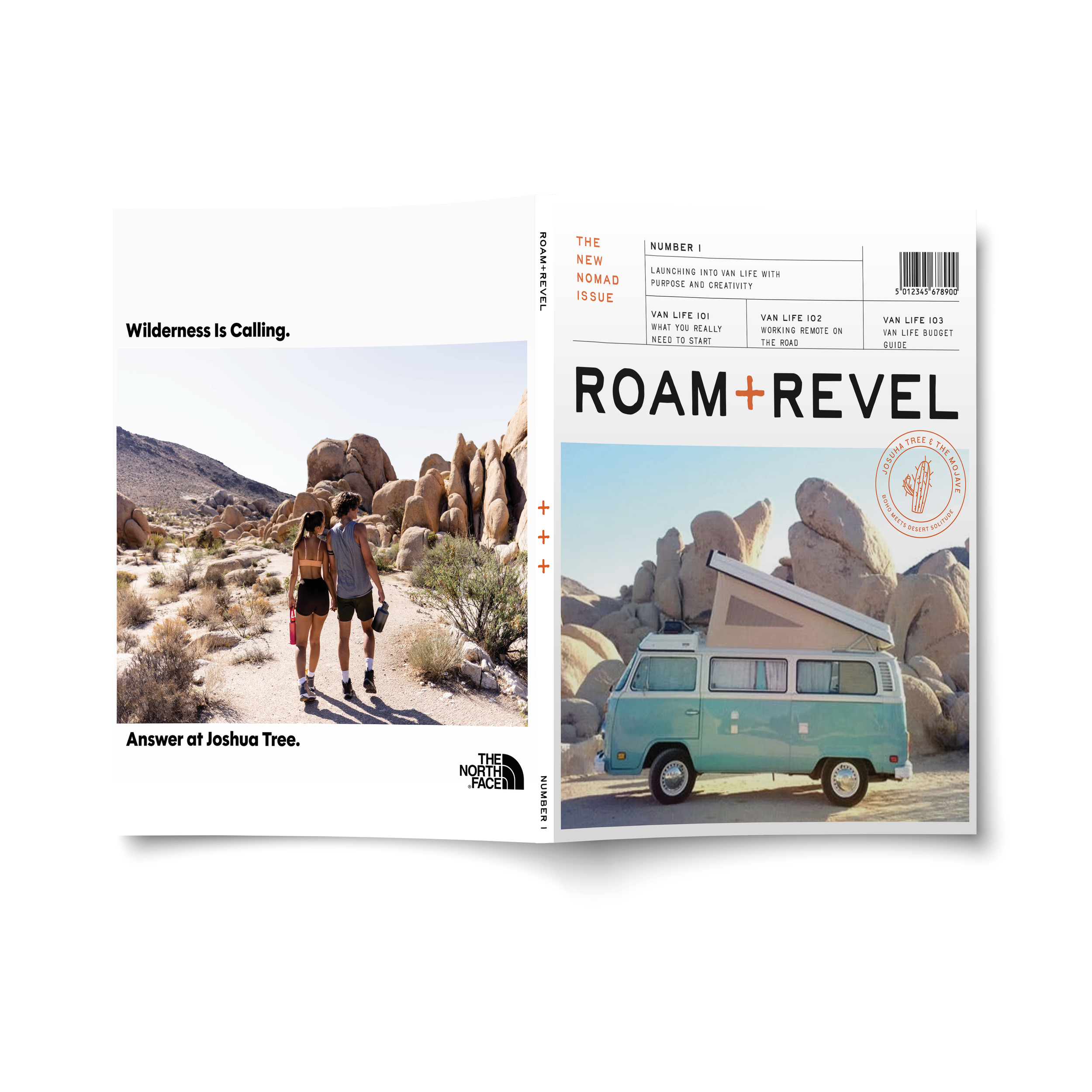
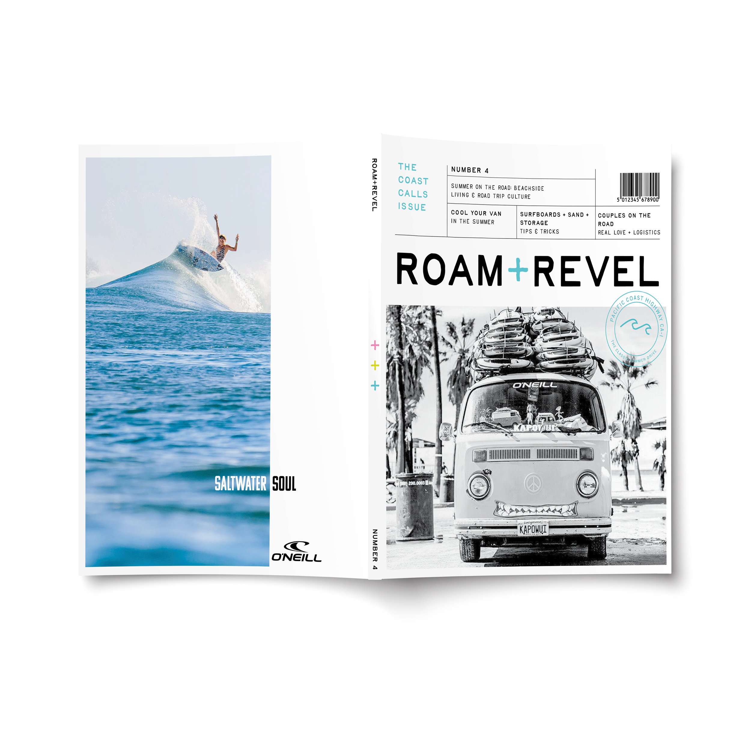
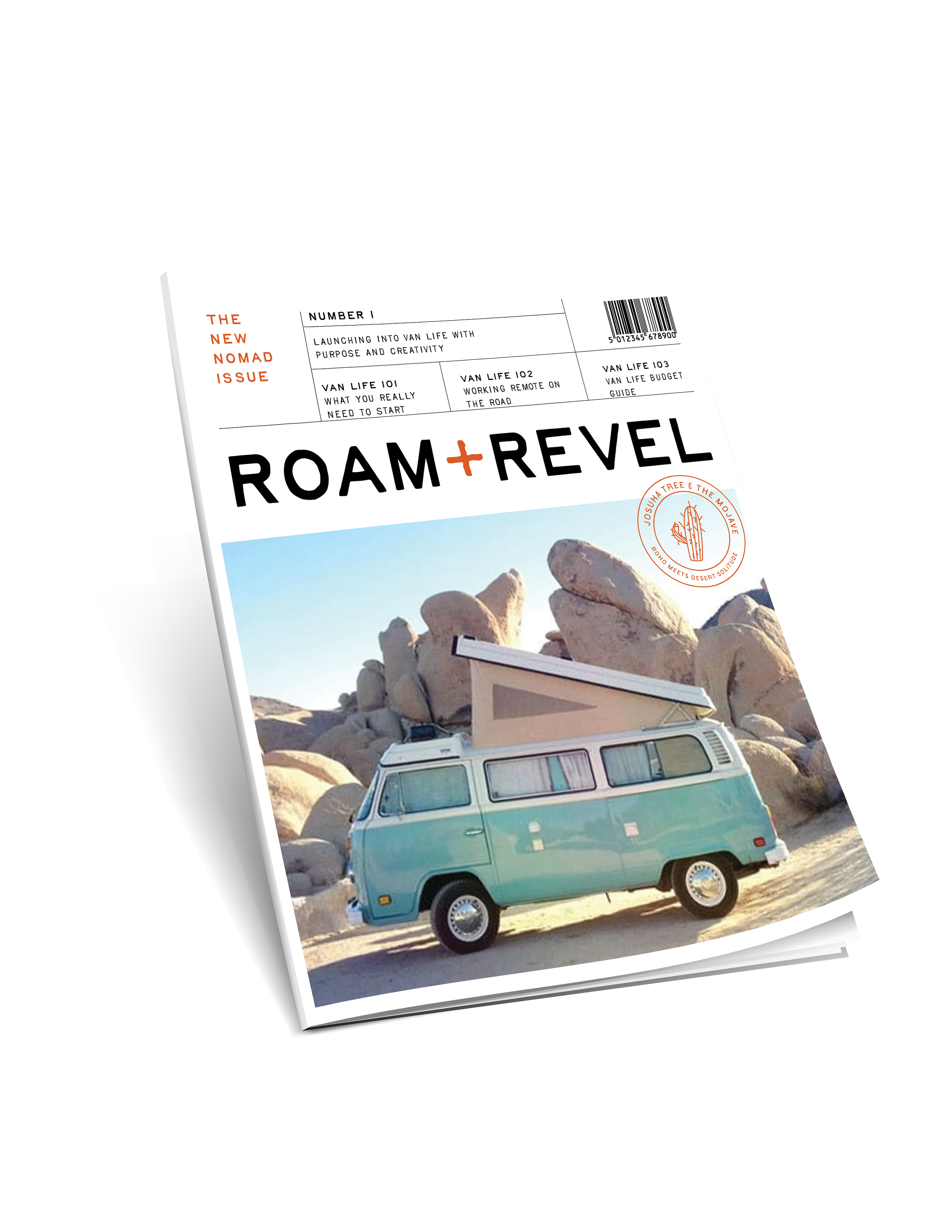
About: Roam & Revel is a lifestyle magazine dedicated to the modern nomad; it’s visually compelling & aimed toward an audience interested in full-time van living. The spirit of exploration is at the forefront of all editorials & photography.
Roam & Revel caters to readers that value adventure and the nomad aesthetic - they’re looking for more than just trip ideas.
Tools used:
Adobe Illustrator
Adobe InDesign
Adobe Photoshop


Visual Inspiration & Moodboarding
The creative process began with moodboarding, pulling together imagery that captured the spirit of Roam & Revel — an adventurous, nostalgic blend of van life culture and vintage travel publications. The goal was to develop a visual world that felt free-spirited and richly textured, while maintaining an aspirational edge — Think sun-drenched coastlines, winding open roads, classic camp culture, and editorial photography with all the good vibes.
Typography Selection
Typography was thoughtfully chosen to balance editorial sophistication with wanderlust-driven charm. A primary serif typeface was selected for its timeless, slightly nostalgic feeling, paired with a clean, modern sans-serif for body text and navigation. The typography system was designed to be both legible and expressive, allowing each issue to feel cohesive while giving space for creative flexibility.
Color Palette Development
A carefully curated color palette grounded the magazine’s visual identity. Earthy neutrals — warm sand, deep ocean blue, sun-faded olive — were paired with seasonal accents like muted terracotta, misty sage, and vintage mustard. This palette created a sense of natural warmth, timelessness, and geographic diversity, while offering enough versatility to shift subtly with each issue’s theme.
Grid Design & Publication System
A modular design grid was created to give the magazine structure and flow. The grid was intentionally flexible, allowing for diverse layouts across features, profiles, and photo essays while maintaining a unified, recognizable look issue-to-issue.
Special attention was given to:
Consistent margins and rhythm
Space for bold covers and full-bleed imagery
Dynamic page layouts to keep readers engaged
The program was built to support monthly releases, ensuring each issue felt part of a larger, evolving collection.