
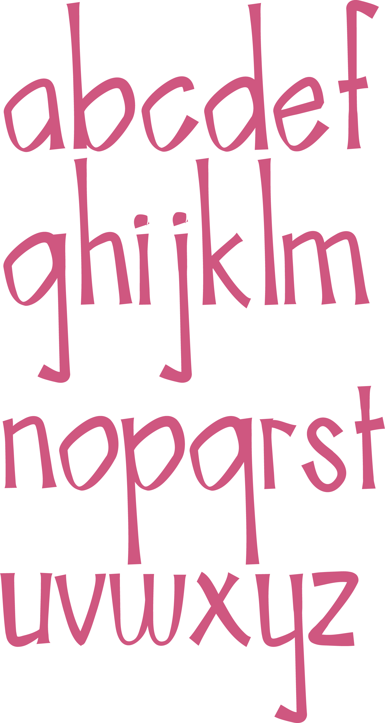
Meet frond.
an organic sans serif typeface created by katemade.
Project Outline: The goal was to develop a memorable typeface that brands could leverage as a distinctive display typeface within their branding packages. Frond needed to balance creative expression with versatility, offering character and personality without sacrificing clarity or usability across various brand applications.
Scope: Display typeface
About: Frond was developed from an exploration of organic shapes derived from — you guessed it — palm fronds. Inspired by the flowing, structural beauty of these natural forms, the project sought to translate their essence into a unique typographic system.
Tools used:
Adobe Illustrator
Adobe InDesign
Adobe Photoshop

The process:
1. Shape Exploration
The project began with an exploration of organic objects, focusing on identifying distinctive, naturally occurring shapes that could inspire a unique typographic form. Through careful observation and sketching, various silhouettes and patterns were collected, with an emphasis on capturing the flowing, structural qualities found in nature. This foundational exploration was critical to establishing an authentic, organic aesthetic for the typeface.
2. Initial Sketches and Digital Outlines
Building on the organic shape study, three initial typeface concepts were sketched by hand. Each concept used the word “adhesion” as the foundational base — chosen for its diverse letterforms — to ensure that the essential characteristics of the proposed typefaces could be visualized early in the process. These sketches were then refined and translated
3. Refinement and Selection of One Pangram
Out of the three developed pangrams, one was chosen for final refinement. This selected pangram best showcased the strengths of the typeface — balancing the organic influence with clear readability and strong visual character. Detailed adjustments were made to letterforms, spacing, and alignment to polish the typeface’s voice, ensuring that it would perform consistently across a range of potential branding and display applications.

Anatomy:
a free-flow structure
The anatomy of Frond blends structure and freedom: strong fundamentals like a consistent baseline and confident stems are paired with open counters, soft bowls, and playful bellies — all shaped by the elegant irregularities of nature.

frond in the wild
Brand: farmette california


